Okay maybe that’s a bit dramatic but the project Rethink The Food Label proposes to at least help curb America’s growing obesity rate. While most of the design community frowns upon crowd-sourced design or design contests as it can often times devalue the potential professional designers offer, I think this one still has some pretty interesting ideas behind it.
 The News21 program, along with designmatters and GOOD, asked designers to rethink our clunky and outdated nutritional food label (our current label has reigned supreme for 20 years!) in hopes of demystifying all those percentages and big words on the back of our Cheerios boxes. While I believe we should all be responsible for knowing what we put in our bodies, the more likely truth is that unless you’re a health nut eating sprouted green grass smoothies in the morning you are probably like the rest of us that need about a gallon of coffee before we can even pour the low fat milk into our cereal, let alone read the back of the box to see how much of what you’re getting. I’ll plead guilty to this one. I doubt I’ve ever even looked at the back of the M&M bag before I shove its entire contents into my mouth. However, if my packaged food had a beautifully designed infographic on the back of it I’d probably be convinced to spend a little time looking it over before I ravaged the top of the package with my teeth trying to get to the goodies inside.
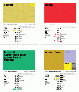
Pictured is Renee Walker’s design concept which won the Rethink contest. I love the use of color coding, icons, and easy to read bar graphs. Now lets just see if they can get the FDA to sign off.